
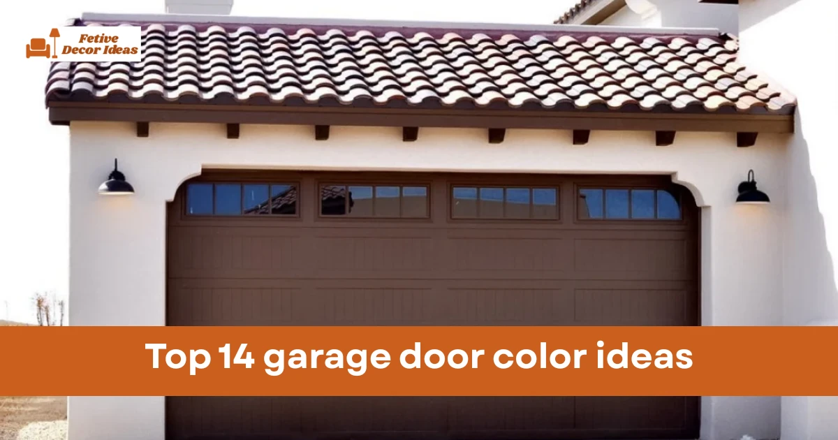
You need a color that says you have your life together even if the inside of your garage is a disaster zone. I have gathered the top options that balance style with actual practicality for every homeowner.
I want to help you avoid the dreaded “wrong white” or a green that looks like a giant pea. These selections focus on modern trends and classic finishes that work in real world lighting conditions.
Understanding light reflectance values (LRV)
I want to let you in on a professional secret: always check the LRV of your chosen paint. This number tells you how much light the color reflects versus how much it absorbs into the door material.
A low LRV means the door will soak up heat which can actually cause some steel doors to expand and contract. This leads to annoying creaks and groans every time the sun hits your garage in the morning.
I suggest staying with a medium LRV if your garage faces south and gets blasted by the sun all day. It will keep your garage temperature lower and save you money on your cooling bills.
You should save the very dark colors like black or charcoal for shaded areas or northfacing garages. This ensures your paint job lasts for a decade instead of peeling off after just two summers.
1. Modern Charcoal Gray for sophisticated homes
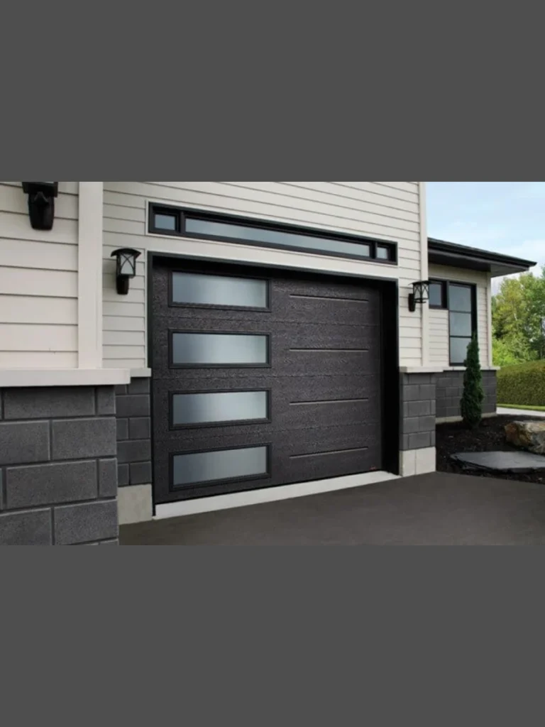
I think charcoal gray is the ultimate cheat code for a stylish exterior. It offers a heavy dose of drama without the harshness that sometimes comes with a pure black finish.
This shade hides road salt and splash marks surprisingly well during rainy months. You will spend much less time with a hose in your hand and more time enjoying the view.
I suggest pairing this with white trim to create a crisp contrast that pops. It looks expensive and gives your property a custom feel that generic beige simply cannot match.
You should consider this if your brick has cool undertones or gray flecks. It anchors the house to the ground and makes the entire structure feel more permanent and solid.
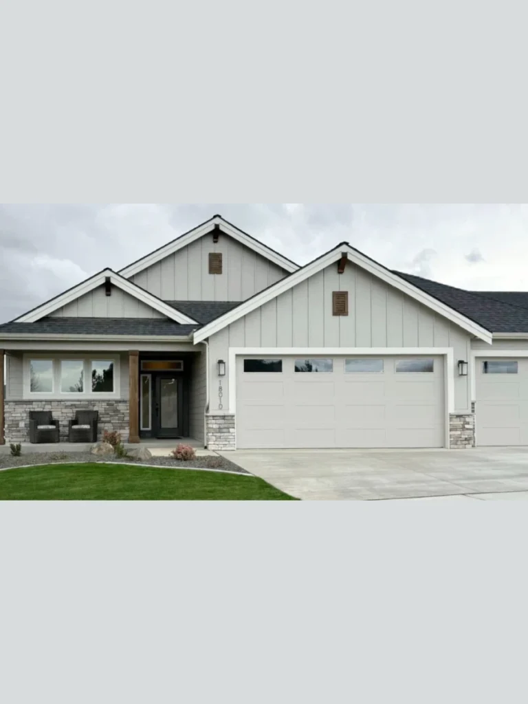
2. Classic Arctic White for a clean look
White is the safest bet for a reason and it never truly goes out of style. I find that a bright white door makes a small home look much larger and more approachable.
You should opt for this if you want your garage to blend seamlessly with your window casings. It creates a unified look that feels intentional rather than a random design choice.
I noticed that white doors reflect the most sunlight which keeps your garage interior cooler. This is a massive win if you use that space for a workshop or a home gym.
Cleaning white might seem like a chore but a quick scrub once a year usually suffices. It provides a blank canvas that allows your landscaping and flowers to be the main stars.
3. Deep Navy Blue for nautical charm
Navy blue is my personal favorite for houses that feature light gray or tan siding. It brings a sense of depth and personality that feels both nautical and very professional.
This color suggests that you are bold enough to experiment but still respect traditional design rules. It looks particularly stunning when you catch it in the golden hour of the afternoon.
I recommend using brass or gold hardware on a navy door for a high-end look. The warm metal tones against the cool blue create a very sophisticated and welcoming entrance.
You will find that navy acts as a neutral color when it is viewed from a distance. It hides minor imperfections in the door surface while providing a rich and velvety visual texture.
4. Warm Walnut Wood Stain for natural texture
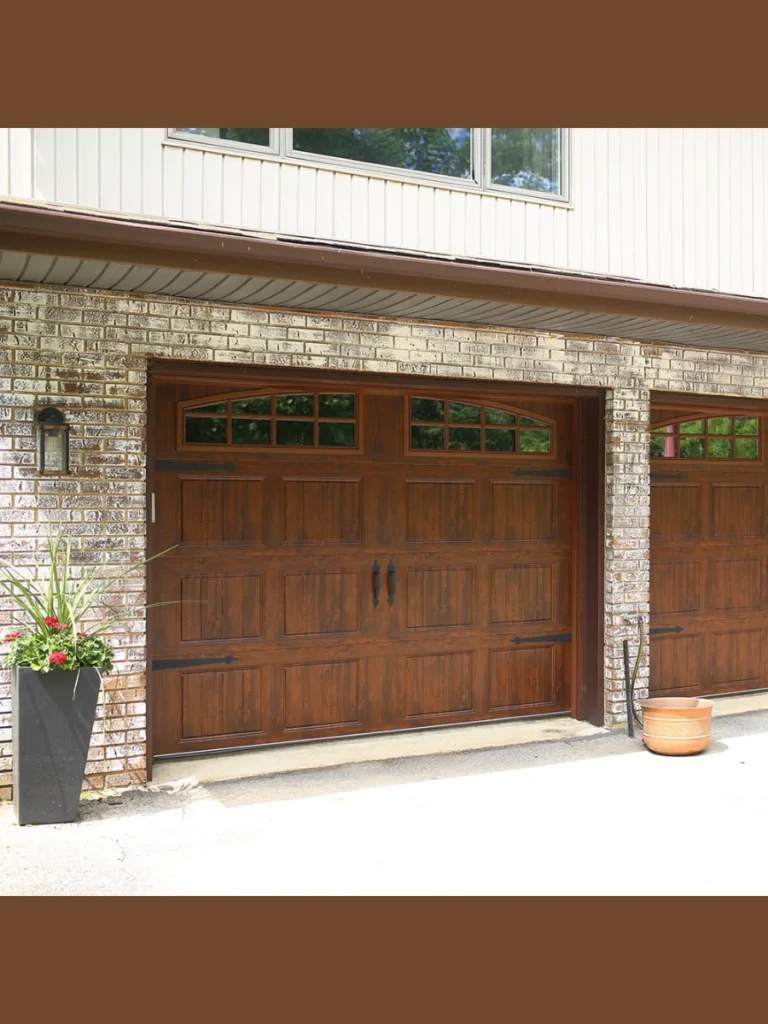
Nothing beats the look of real wood even if you are just using a very clever paint. I love how a walnut finish adds instant warmth to a cold or modern exterior design.
This option works perfectly for homeowners who want to soften the look of concrete or stone. It brings a bit of nature back to the front of your house in a big way.
I suggest choosing a high quality UV resistant stain to prevent the sun from fading the richness. A well maintained wood look can significantly increase the resale value of your entire property.
You can achieve this look with fiberglass or steel doors that have a molded grain. It gives you all the beauty of timber without the constant warping or rot issues.
5. Sage Green for a soft organic feel
Sage green is the perfect choice if you want your home to harmonize with your garden. I find this earthy tone incredibly relaxing to look at every time I pull into the driveway.
This shade works wonders on cottage style homes or any house with a lot of stonework. It feels organic and soft rather than aggressive or overly bright like some other greens.
I like that sage green masks green pollen or dust that might settle during the spring. It is a low-maintenance color that keeps your curb appeal high without constant effort.
You should pair this with cream or off white trim for a very classic and timeless appearance. It feels like a breath of fresh air compared to the sea of brown houses.
6. Bold Black for a contemporary statement
I think black garage doors are the peak of modern luxury when they are done correctly. They provide a sharp and defining frame that makes every other color on your house stand out.
You need to be aware that black absorbs a lot of heat during the summer months. I only recommend this if your garage is well insulated or stays mostly in the shade.
I love how black hides the shadows of deep panels and creates a very sleek silhouette. It looks incredible on industrial style homes or white farmhouses that need a bit of edge.
You will find that a matte black finish is much easier to keep looking good than a gloss. It hides small dents or scratches that might happen over years of heavy daily use.
7. Soft Sandstone Beige for subtle elegance
Sandstone is the hero for people who want something better than white but lighter than brown. I see this as a very polite color that never offends the neighbors or the eyes.
This shade is excellent for hiding the light-colored dust found in many suburban areas. You can go weeks without washing it and it will still look perfectly presentable from the street.
I suggest this color if your house has a lot of warm toned brick or tan shingles. It pulls the different elements of the facade together without being the center of attention.
You can easily update the look by changing your front door to a much brighter accent. Sandstone stays in the background and lets your other design choices do the heavy lifting.
8. Slate Gray for a balanced neutral
I find slate gray to be the perfect middle ground for homeowners who cannot decide between light and dark. It offers a stony and natural appearance that feels incredibly grounded and reliable.
This color works brilliantly with almost any siding material including vinyl, wood, or modern fiber cement. You will appreciate how it stays looking clean even after a heavy rainstorm.
I suggest using this shade if you have a lot of blue or green in your landscaping. The cool undertones of slate gray complement the natural world without looking artificial or forced.
You should consider a satin finish for this color to give it a slight bit of dimension. It catches the light just enough to show off the door panels without creating a glare.
9. Deep Crimson Red for a classic barn feel
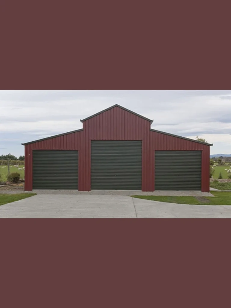
Red is a bold move that I think pays off massively if you want a traditional or rustic look. It creates an instant focal point that makes your home easy to find for visitors.
I recommend a darker crimson or burgundy rather than a bright fire engine red for the best results. A deeper tone feels more expensive and less like a fast-food restaurant’s primary branding.
You will find that red looks stunning against white or light tan siding for a farmhouse aesthetic. It provides a warm and welcoming vibe that feels very much like a cozy home.
I like how red stands out during the winter months when everything else looks gray and dead. It brings a much needed pop of energy to your property when the sun is hiding.
10. Taupe and Greige for versatile warmth
I believe greige is the most popular color in the world right now for a very good reason. It blends gray and beige into a hue that works with both warm and cool palettes.
This is the ultimate “safe” choice if you are planning to sell your home in the next year. It appeals to almost every buyer because it looks clean, modern, and very well-maintained.
I suggest pairing a greige door with dark bronze hardware for a very sophisticated and subtle look. It feels high-end without screaming for attention like some of the darker bold shades.
You will love how this color changes slightly depending on the time of day and the clouds. It can look like a warm tan in the morning and a cool gray by evening.
11. Forest Green for a timeless woodland look
Forest green is a fantastic choice for homes tucked away in wooded areas or older neighborhoods. I find that it adds a sense of history and permanence to a newer building.
This shade is remarkably good at hiding dirt and organic debris that might blow against the door. You can get away with being a little lazy on the cleaning schedule here.
I recommend this for brick homes that have a lot of orange or deep red tones in them. The green acts as a natural complement to the red brick and creates a balanced facade.
You should avoid this if your house is already surrounded by very dark evergreen trees and shadows. In those cases, the door might disappear into the darkness and look like a black hole.
12. Sky Blue for a cheerful coastal vibe
I think sky blue is a brave and refreshing choice for people living near the water or in sunny spots. It feels lighthearted and makes the entire house feel much more breezy and open.
This color works best on smaller homes or cottages where a dark door might feel too heavy. It adds a bit of whimsy that tells your guests you don’t take life too seriously.
I suggest keeping the rest of the house trim white to ensure the blue looks intentional and crisp. Too many other colors can make a blue garage door look a bit chaotic.
You will find that this shade makes your garage feel like an extension of the sky on a clear day. It is a great way to boost your mood every time you arrive home.
13. Bronze or Copper Metallic for a custom feel
Metallic finishes are my go-to recommendation for anyone building a truly modern or industrial-style home. A bronze door looks like a piece of custom metalwork rather than just a garage.
I love how these colors shimmer under exterior lighting at night to create a very dramatic entrance. It looks incredibly expensive and gives your home a “wow” factor that paint cannot.
You should be prepared for a bit more maintenance to keep the metallic sheen looking its best. Dust and fingerprints can show up more easily on these reflective surfaces than on matte paint.
I recommend this if you have copper gutters or bronze light fixtures elsewhere on your home. Matching these metallic accents creates a very high-end and cohesive architectural look for the street.
14. Pale Yellow for a sunny welcoming entrance
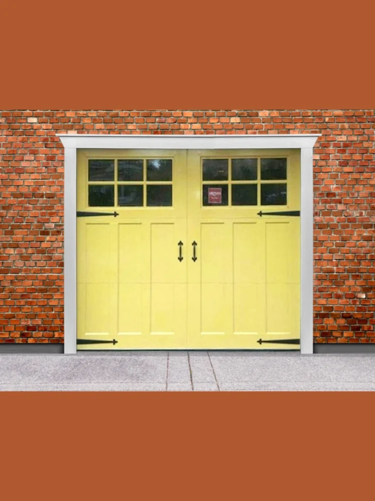
Yellow might sound scary but a pale buttery shade can be incredibly charming on the right house. I think it adds a layer of friendliness that makes your home the brightest on the block.
This works best with gray or white siding where it can act as a soft and cheerful accent. It feels very much like a traditional Victorian or Cape Cod style design choice.
I suggest staying away from neon yellows and sticking to shades that have a bit of cream in them. You want it to look like a sun kissed surface rather than a highlighter pen.
You will notice that yellow reflects light well and can help brighten up a dark or narrow driveway. It is a great way to make a shaded part of your property feel more inviting.
Factors to check before picking a color
| Feature | Importance | What to look for |
| Home Siding | Very High | Ensure the undertones match (warm vs cool). |
| Sun Exposure | High | Dark colors fade faster and absorb more heat. |
| HOA Rules | Essential | Check if your neighborhood has a pre approved list. |
| Resale Value | Medium | Neutrals are better for selling; bolds are for living. |
Expert tips for painting your garage door successfully
I suggest checking the weather forecast for a clear string of dry days before you even open a paint can. Humidity is the secret enemy of a smooth finish and can cause your hard work to bubble or peel prematurely.
You should always take the time to clean the surface with a degreaser to remove years of road grime and oil. Paint will not stick to a dirty door and skipping this step is a recipe for a total disaster.
I recommend applying two thin coats rather than one thick one to avoid those ugly drips and runs. It takes a bit more patience but the professional look you get at the end is worth every extra minute.
How to match your garage to your front door
I think the biggest debate in home design is whether the garage should match the front door or the siding. My personal rule is that the front door should be the star while the garage is the supporting actor.
You can paint them the same color if your home is small and you want to create a unified look. This helps the house appear wider and more substantial when viewed from the sidewalk or the street.
I suggest using a slightly darker version of your garage color for the front door to create a sense of hierarchy. It draws the eye toward your entrance which is exactly what good curb appeal should do.
Conclusion
I think picking a new garage door color is the best way to give your home a fresh personality without a full renovation. We have looked at everything from the safety of white to the bold statement of crimson red and metallic bronze.
You should now feel ready to pick a shade that complements your siding and makes your neighbors just a little bit jealous. I suggest testing a small sample on the door first to see how it looks in different lighting.
I am confident that any of these top 14 ideas will help you create a beautiful and welcoming entrance to your home. Happy painting and I look forward to hearing how your driveway transformation turns out for your curb appeal.
FAQs
I am seeing a huge surge in dark charcoal and soft greige tones this year for most modern homes. These colors offer a clean look that works with the current trend of white and black farmhouse styles.
I have noticed that black doors can get quite hot to the touch when they are sitting in direct afternoon sun. If you live in a scorching climate you should ensure your door is well insulated to protect your garage.
I generally recommend going slightly darker than your siding if you want a grounded and modern look for your property. A lighter door can work well if you are trying to make a small cottage feel more spacious.
You can absolutely handle this project yourself as long as you use a high-quality exterior paint rated for metal surfaces. I suggest using a roller for the flat panels and a brush for the recessed trim pieces.
I believe that a very bright or unusual color might turn off some traditional buyers if you plan to sell soon. However a tasteful navy or deep green often adds more value than a boring and faded beige.