
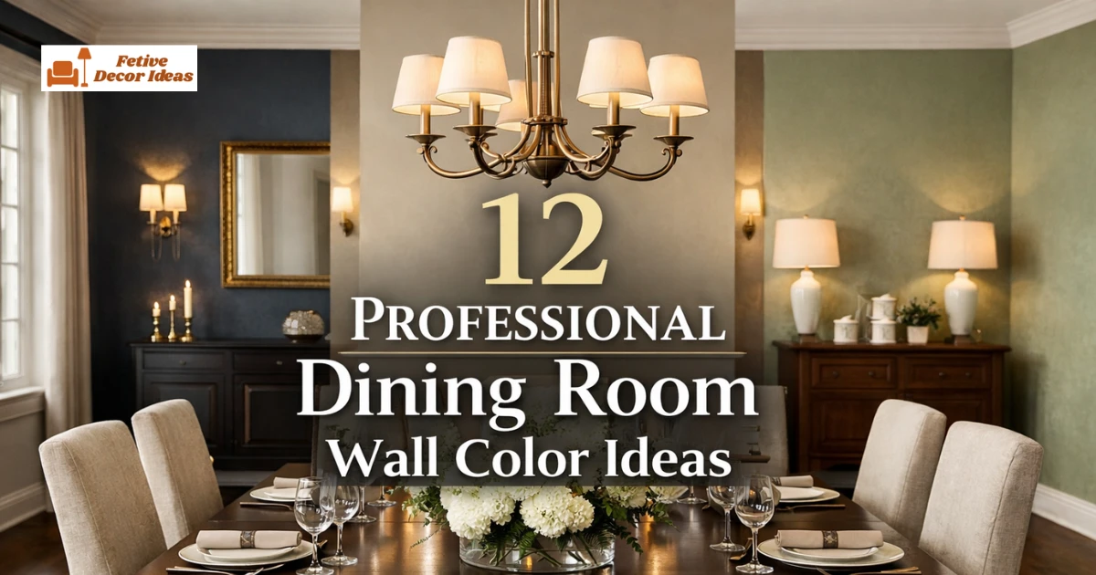
Professional dining room wall color ideas focus on balance, elegance, and timeless appeal. I always tell my readers that color sets the mood before furniture even speaks.
When I choose a wall color, I think about lighting, furniture, and how guests will feel at the table. The right paint shade can make a simple dining room look thoughtfully designed.
If you want a dining space that feels polished, mature, and welcoming, wall color becomes your first design decision. Let’s start with colors that truly look professional, not trendy for just one season.
1. Warm Greige for a Modern Professional Dining Room
Warm greige gives a dining room a balanced and structured appearance. I love this shade because it blends gray and beige without feeling cold or flat.
This color works beautifully in open concept homes where the dining area connects to the living space. It pairs well with wooden dining tables, black metal chairs, and soft cream curtains.
If you want a safe yet refined option, greige creates a clean background that highlights artwork and lighting fixtures. Choose a matte or eggshell finish for a smooth, professional look.
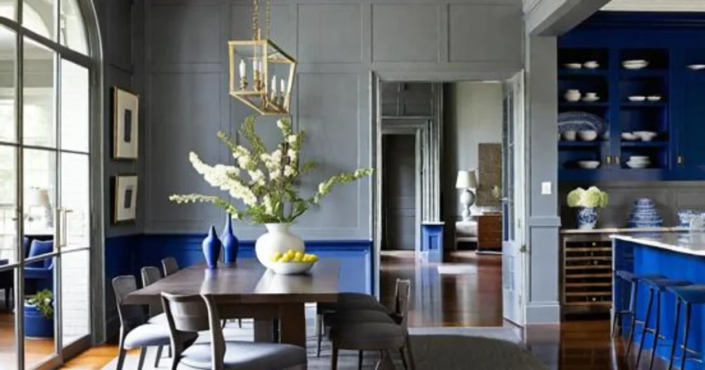
2. Deep Navy Blue for a Formal and Elegant Dining Space
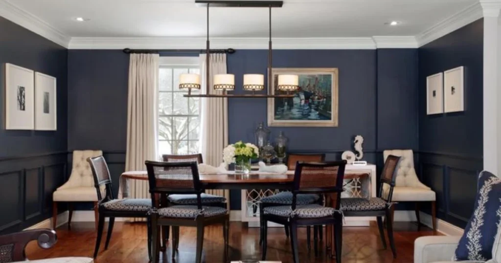
Deep navy blue creates a formal dining room atmosphere instantly. I often recommend navy when homeowners want something bold but still sophisticated.
This shade works best in rooms with good natural or layered lighting. Pair navy walls with brass light fixtures, white trim, and a solid wood table to keep the room balanced.
If your dining room feels plain, navy adds depth without looking dramatic in a negative way. It gives a structured and confident tone that many professional interiors use.
3. Soft Taupe for a Timeless Professional Look
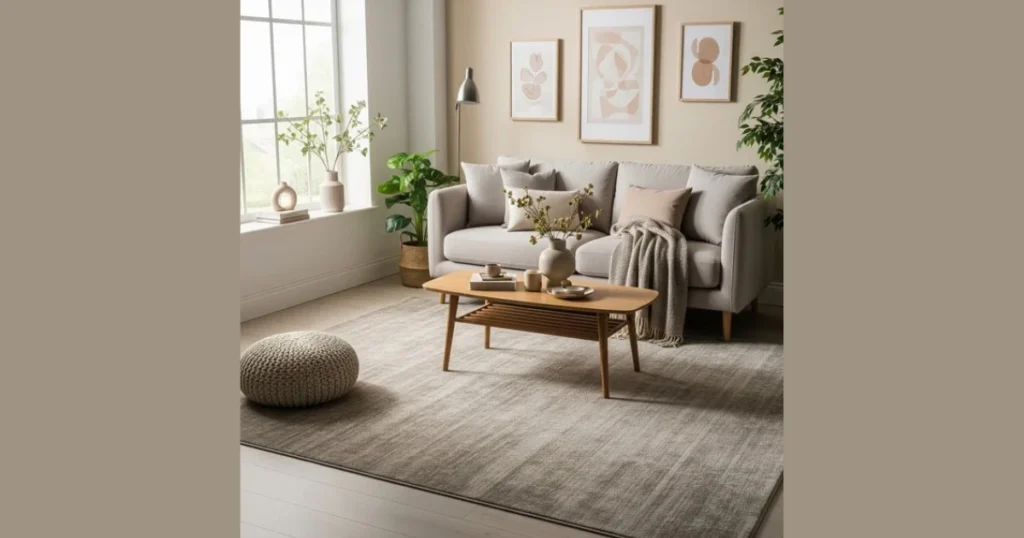
Soft taupe offers a calm and polished dining room environment. I appreciate taupe because it feels warm without turning yellow or dull.
This shade complements both traditional and modern dining furniture. It also works beautifully with linen curtains, neutral rugs, and simple framed art.
If you want a long-term color choice, taupe rarely goes out of style. It keeps the room light while maintaining a mature and designer-like feel.
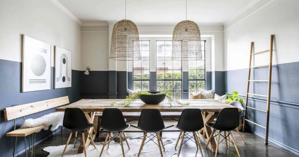
4. Charcoal Gray for a Strong and Structured Statement
Charcoal gray creates a strong visual impact in professional dining rooms. I suggest this color for homeowners who enjoy depth and contrast.
This shade looks impressive behind a light wood or white dining table. Add warm lighting and metallic accents to prevent the room from feeling too heavy.
Charcoal gray works especially well as an accent wall. It frames the dining area and creates focus without overwhelming the entire room.
5. Muted Sage Green for a Calm Professional Atmosphere
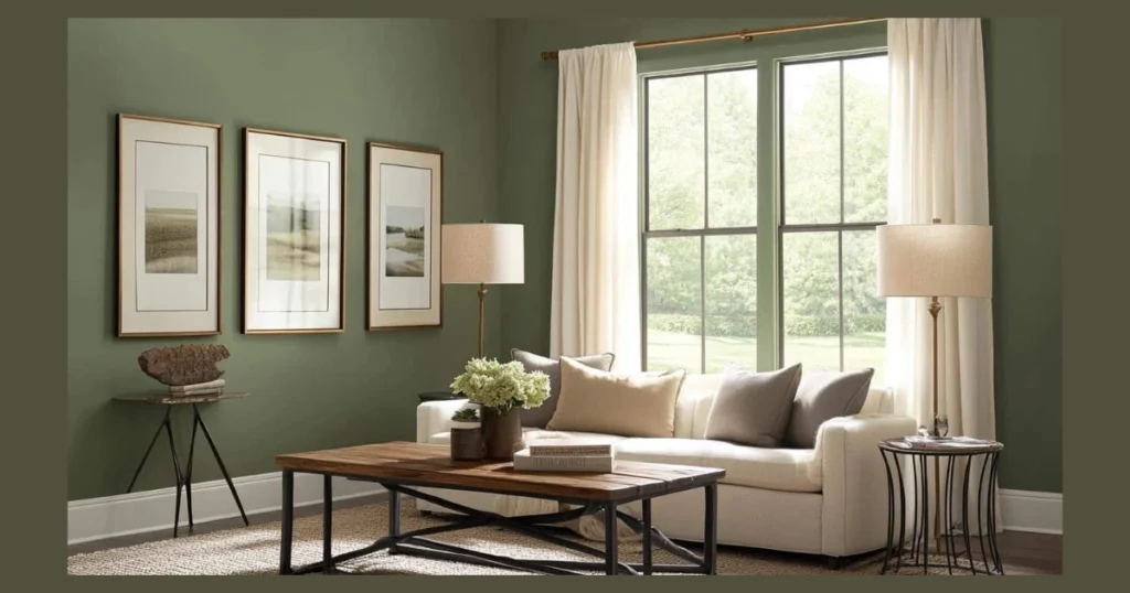
Muted sage green gives a dining room a fresh yet refined character. I like this shade because it adds subtle color without becoming loud.
This tone pairs beautifully with natural wood, rattan elements, and soft white décor. It works well in homes that prefer a light and airy style.
If your goal is to create a welcoming dining space for family dinners and guests, sage green offers calmness with a professional finish.
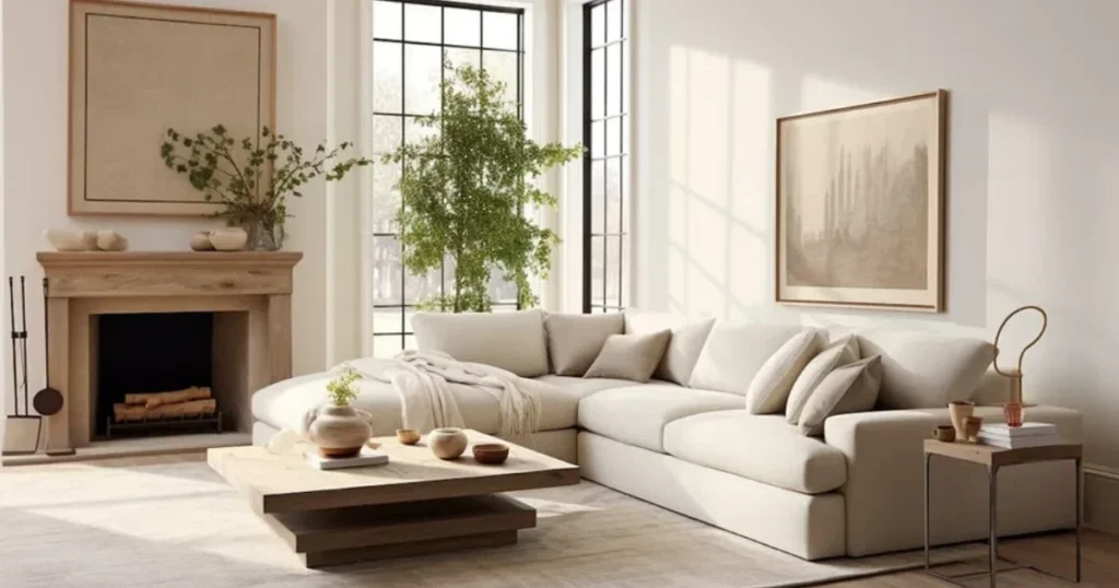
6. Classic Off-White for a Clean and Professional Finish
Classic off-white keeps a dining room bright and structured. I often recommend warm whites instead of pure bright white because they feel more inviting.
This color allows furniture and lighting to stand out clearly. It also works perfectly in small dining rooms where you want to enhance light reflection.
Off-white becomes the safest professional wall color choice when you plan to change décor often. It adapts easily without requiring a repaint every year.
7. Rich Olive Green for a Sophisticated Dining Room Setting
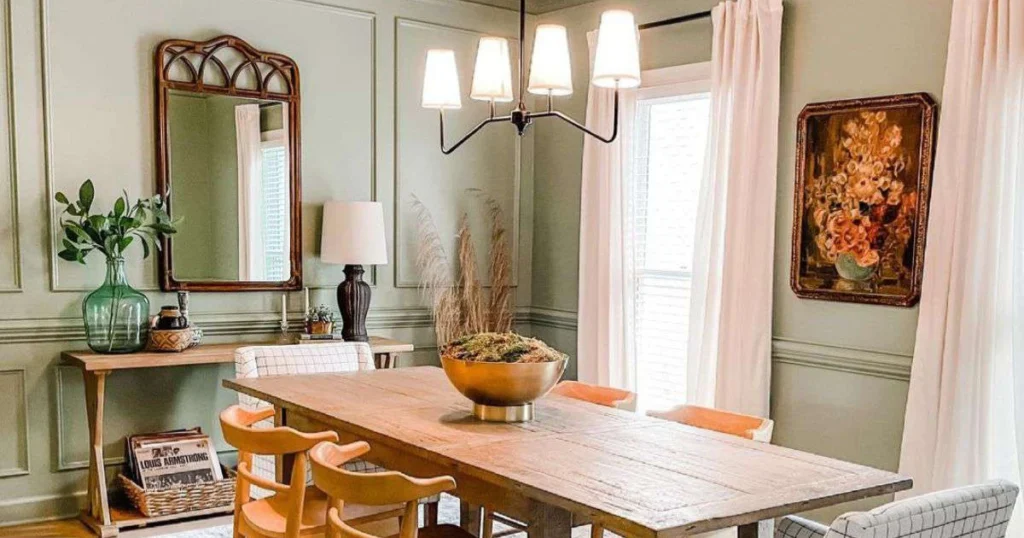
Rich olive green adds warmth and depth to a professional dining room. I personally like olive because it feels grounded and elegant at the same time.
This shade works well with dark wood furniture, leather chairs, and brass lighting. It creates a welcoming mood without making the space feel heavy.
If your dining area lacks character, olive green brings personality while still looking refined. Use warm white bulbs to keep the tone balanced and inviting.
8. Smoky Blue for a Balanced and Professional Dining Interior
Smoky blue gives a dining room a calm and structured appearance. I often suggest this color when someone wants blue without going too bold.
This tone pairs beautifully with white trim, oak tables, and subtle metallic accents. It keeps the space soft while maintaining a mature look.
If you want a professional dining room wall color that feels relaxed but polished, smoky blue offers that balance perfectly.
9. Warm Beige for a Classic and Professional Dining Room
Warm beige creates a stable and timeless dining room backdrop. I recommend beige when homeowners want comfort without compromising elegance.
This color works especially well in homes with limited natural light. It reflects warmth and pairs nicely with cream upholstery and wooden flooring.
If you prefer a traditional dining setup, beige delivers consistency and a clean presentation. It remains one of the safest professional dining room wall colors.
10. Dusty Rose for a Soft Yet Professional Statement
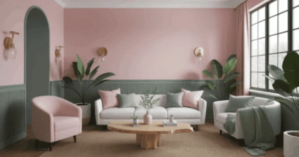
Dusty rose adds subtle warmth without feeling decorative or loud. I know pink tones sound risky, but this muted version feels mature and structured.
This color pairs well with walnut furniture and soft gold lighting. It creates a welcoming environment that feels thoughtful rather than trendy.
If you want a dining space that feels unique but still professional, dusty rose can surprise you in the best way. Keep the décor minimal to maintain balance.
11. Slate Blue-Gray for a Refined and Modern Dining Room
Slate blue-gray combines cool tones with a polished finish. I appreciate this shade because it feels contemporary yet grounded.
This color looks impressive with white ceilings, dark dining tables, and simple artwork. It creates depth without overpowering the space.
If your goal is a modern professional dining room, slate blue-gray offers structure and subtle sophistication in one shade.
12. Warm Chocolate Brown for a Bold Professional Dining Space
Warm chocolate brown creates a rich and formal dining room atmosphere. I suggest this color for larger dining areas with strong lighting.
This shade pairs beautifully with cream upholstery and metallic chandeliers. It delivers contrast while maintaining an organized and elegant feel.
If you want your dining room to look upscale and intimate, chocolate brown adds depth and warmth in a confident way.
Professional Dining Room Wall Color Selection Guide
Choosing the right professional dining room wall color depends on room size, lighting, and furniture tone. I always test a small paint sample before committing to a full wall.
Natural light changes how paint appears throughout the day. I recommend observing the color in morning and evening light before making a final decision.
Here is a quick reference table to help you match wall colors with dining room conditions.
Dining Room Wall Color Quick Comparison Table
| Wall Color | Best For | Lighting Requirement | Furniture Pairing | Style Type |
|---|---|---|---|---|
| Warm Greige | Open concept rooms | Medium to bright | Wood, black metal | Modern professional |
| Deep Navy | Formal dining rooms | Bright or layered | White trim, brass | Elegant classic |
| Soft Taupe | Neutral interiors | Any light | Linen, oak | Timeless |
| Charcoal Gray | Accent walls | Bright light | White, light wood | Contemporary |
| Muted Sage | Airy homes | Natural light | Rattan, wood | Calm professional |
| Olive Green | Rich interiors | Warm lighting | Dark wood, leather | Sophisticated |
| Smoky Blue | Balanced design | Medium light | Oak, white | Modern |
| Warm Beige | Low light rooms | Soft lighting | Cream, wood | Traditional |
| Dusty Rose | Statement walls | Warm light | Walnut, gold | Soft elegance |
| Slate Blue-Gray | Modern homes | Medium to bright | Dark wood | Refined modern |
| Chocolate Brown | Large rooms | Strong light | Cream upholstery | Formal |
Practical Tips for a Professional Paint Finish
Professional dining room wall color ideas also depend on paint finish. I usually recommend eggshell or satin for dining rooms because they look smooth and clean.
Matte finish hides wall imperfections but may show stains over time. Satin finish reflects slight light and works better for families who entertain often.
Before painting, always prepare walls properly. Clean surfaces and use primer to achieve a consistent professional result.
Styling Tips to Make Your Professional Dining Room Wall Color Look Even Better
Professional dining room wall color ideas work best when you style the space with intention. I always remind myself that paint alone cannot carry the entire design.
Lighting, textiles, artwork, and furniture tone must support the wall color. When these elements align, the room feels structured and thoughtfully arranged.
Let me share a few practical styling tips that I personally follow when finishing a professional dining room space.
1. Choose the Right Lighting Temperature
Lighting changes how your wall color appears throughout the day. I always prefer warm white bulbs between 2700K and 3000K for dining rooms.
Cool lighting can make warm greige or taupe look dull. Warm lighting enhances olive green, navy, and chocolate tones beautifully.
Test your lighting before finalizing paint. A simple bulb swap can improve the overall mood instantly.
2. Balance Dark Wall Colors with Light Elements
Dark professional dining room wall colors need contrast to stay balanced. I pair navy or charcoal walls with lighter dining chairs or rugs.
White trim also sharpens dark shades and prevents the space from feeling heavy. Balance keeps bold colors elegant rather than overpowering.
If the room feels too dark, add mirrors or metallic décor to reflect light. Small adjustments make a big difference.
3. Match Curtains and Upholstery Carefully
Curtains frame your dining room walls. I usually select neutral curtains when walls carry strong colors like olive or slate blue-gray.
Heavy patterned curtains can compete with bold walls. Keep fabrics simple to maintain a refined and professional look.
Linen, cotton blends, and subtle textures add softness without distraction.
4. Use Accent Walls with Purpose
Accent walls create focus in professional dining rooms. I often paint the wall behind the dining table in charcoal or navy for impact.
The remaining walls stay lighter to maintain brightness. This method works well in smaller dining spaces.
Avoid random accent placement. The focal wall should naturally draw attention when someone enters the room.
How to Choose the Best Professional Dining Room Wall Color for Your Space
Choosing the best professional dining room wall color depends on room size, ceiling height, and natural light. I always analyze these three factors first.
Small dining rooms benefit from lighter shades like soft taupe, warm beige, or off-white. Dark colors may shrink the space visually.
Large dining rooms can handle richer shades like chocolate brown or deep navy. Strong lighting keeps them balanced and inviting.
Conclusion
The best professional dining room wall color ideas focus on balance, structure, and timeless appeal. When you choose shades like warm greige, navy, taupe, or olive, you create a refined atmosphere.
I believe paint should support your lifestyle and furniture, not compete with them. A thoughtful color choice makes every dinner feel intentional.
If you follow the guidance above and consider lighting, space, and furniture, you will create a dining room that feels elegant and welcoming for years.
FAQs
Warm greige and soft taupe remain the most professional choices. They create balance and work with almost any furniture style.
Dark colors like navy or charcoal work well in dining rooms with proper lighting. They create depth and a formal atmosphere.
Painting all walls the same color creates consistency. Accent walls work better in smaller dining areas for visual focus.
Eggshell or satin finish works best for dining rooms. These finishes look smooth and allow easy cleaning.
Beige feels warmer and traditional. Greige feels modern and neutral with subtle gray undertones.
Muted sage and olive green look refined when paired with natural wood and warm lighting.
Most dining rooms need repainting every five to seven years. High traffic homes may require touch-ups sooner.