
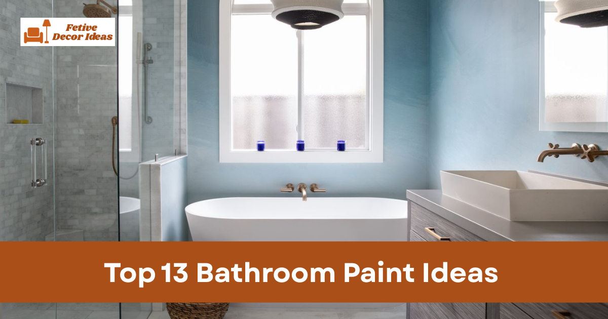
Bathroom paint ideas can completely change how your space feels without any renovation. A new wall color can make a small bathroom look brighter and cleaner in just one weekend. If you want a simple upgrade, paint is the fastest and most affordable solution.
I always suggest starting with color before replacing fixtures or tiles.
Paint sets the mood and highlights everything else in the room.
The right shade makes even old cabinets look better.
How to Choose the Best Bathroom Paint Colors
The best bathroom paint ideas focus on light, balance, and durability.
Bathrooms face humidity daily, so color and finish both matter.
A smart choice saves effort and prevents repainting soon.
I usually test samples on the wall before committing.
Lighting changes how paint looks in the morning and evening.
Always check colors under natural and artificial light.
1. Soft White Bathroom Paint for a Clean Look
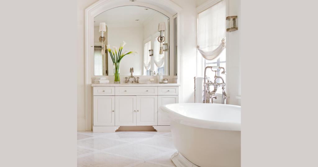
Soft white bathroom paint creates a bright and timeless atmosphere.
It reflects light and makes small bathrooms appear larger.
This shade works well with almost any tile color.
I prefer warm white instead of pure stark white.
Warm tones prevent the bathroom from feeling cold.
They also pair nicely with wooden shelves.
White walls also highlight decorative elements clearly.
Mirrors and metal fixtures stand out beautifully.
This option suits both modern and traditional spaces.
2. Light Gray Bathroom Paint for Modern Style
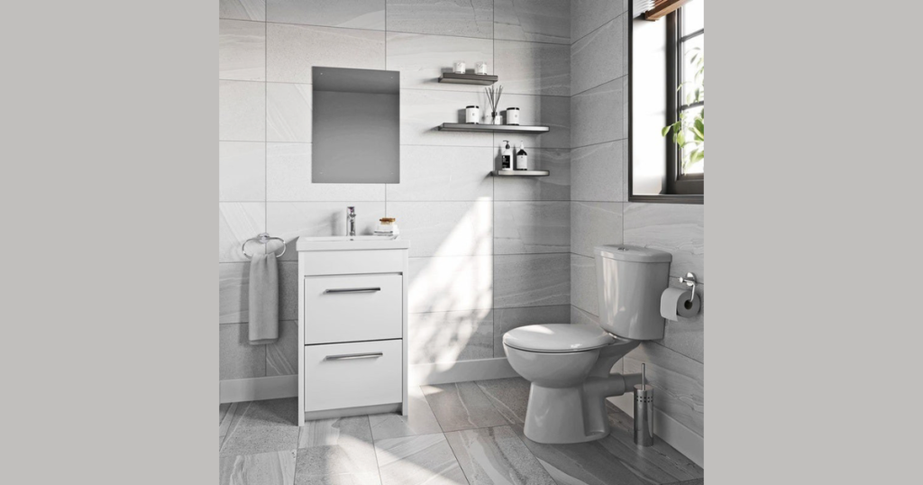
Light gray bathroom paint adds subtle elegance without overpowering the space.
It works well in bathrooms with white cabinets.
Gray provides contrast while staying neutral.
Choose a gray with warm undertones for comfort.
Cool gray may feel too sterile in small rooms.
Balance gray walls with bright lighting.
I often recommend gray for rental homes.
It looks polished but not dramatic.
This shade appeals to most homeowners.
3. Pale Blue Bathroom Paint for Calm Vibes
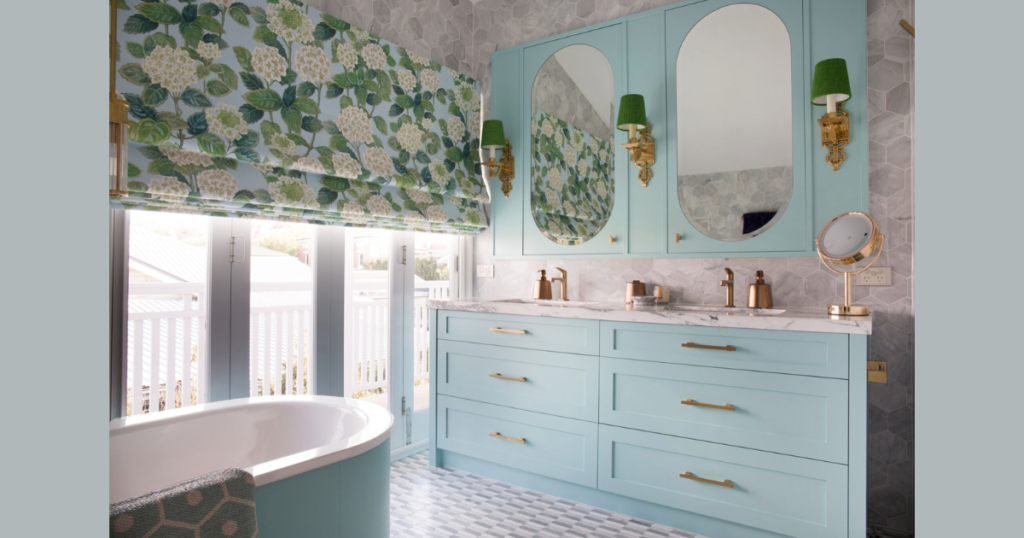
Pale blue bathroom paint creates a relaxing mood instantly.
Soft blue reminds me of spa interiors.
It feels fresh and peaceful.
Pair pale blue with white trim for balance.
Silver fixtures look great against this color.
Avoid very dark blue in tiny bathrooms.
Blue works well in bathrooms with natural light.
It enhances brightness without overwhelming the room.
This is a safe yet stylish choice.
4. Sage Green Bathroom Paint for Natural Feel
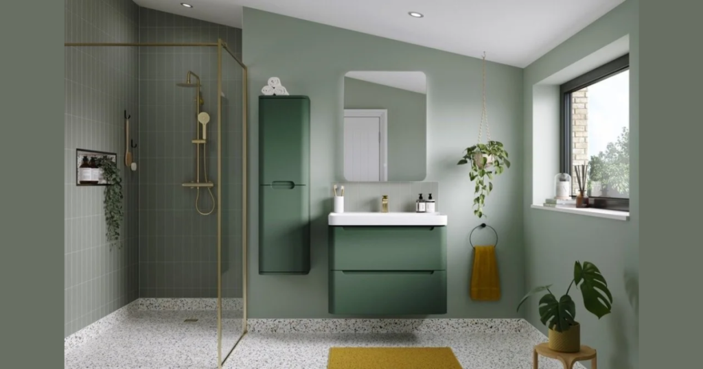
Sage green bathroom paint brings the subtle nature indoors.
It adds softness without becoming too bold.
This shade feels current and refreshing.
Combine sage green with wooden accents.
Natural textures complement this color beautifully.
Brass hardware also pairs well.
I like sage green in bathrooms with plants.
The greenery looks richer against it.
It creates a peaceful environment.
5. Beige Bathroom Paint for Warm Comfort
Beige bathroom paint adds warmth and simplicity.
It suits bathrooms with cream tiles.
This shade creates a cozy feel.
Choose a beige with slight gray undertones.
Pure yellow beige can look outdated.
Modern beige feels soft and balanced.
Beige works well in family bathrooms.
It hides minor marks better than white.
This makes maintenance easier.
6. Navy Blue Accent Wall for Bold Contrast
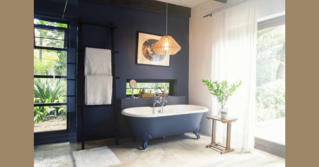
Navy blue bathroom paint works best as an accent wall.
It creates drama without overwhelming the space.
Use it behind the vanity or mirror.
Pair navy with white or light gray walls.
Contrast keeps the room balanced.
Add good lighting to prevent darkness.
I avoid painting all walls navy in small bathrooms.
It can reduce visual space.
Accent use feels smarter and more stylish.
7. Blush Pink Bathroom Paint for Soft Elegance
Blush pink bathroom paint adds subtle charm.
It feels warm without looking childish.
This color works well with gold fixtures.
Choose muted blush instead of bright pink.
Soft tones look sophisticated.
They pair nicely with marble patterns.
Blush pink suits powder rooms beautifully.
It adds personality without overwhelming.
Guests often compliment this choice.
8. Charcoal Gray for Dramatic Modern Bathrooms
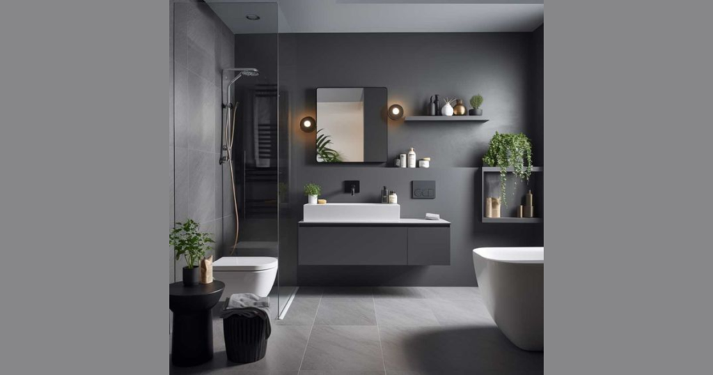
Charcoal gray bathroom paint creates a bold and moody feel.
It suits larger bathrooms with good lighting.
This color feels strong and contemporary.
Balance charcoal with white ceilings and fixtures.
Too much dark tone may feel heavy.
Proper lighting keeps it fresh.
I recommend charcoal for statement bathrooms.
It adds character instantly.
Use carefully in small spaces.
9. Mint Green for Fresh Small Bathrooms
Mint green bathroom paint brightens compact spaces.
It reflects light while adding color.
This shade feels youthful and clean.
Pair mint with white trim and light wood.
Avoid pairing with dark tiles.
Light combinations look better.
Mint works well in guest bathrooms.
It adds charm without drama.
This shade feels cheerful.
10. Creamy Off White for Subtle Warmth
Creamy off-white bathroom paint softens the space gently.
It looks warmer than plain white.
This shade suits classic bathrooms.
Pair it with chrome or brushed nickel fixtures.
Neutral tones stay versatile.
They adapt to changing decor easily.
Off-white hides small imperfections better.
It feels welcoming and calm.
This makes it practical and stylish.
11. Dusty Lavender for Unique Character
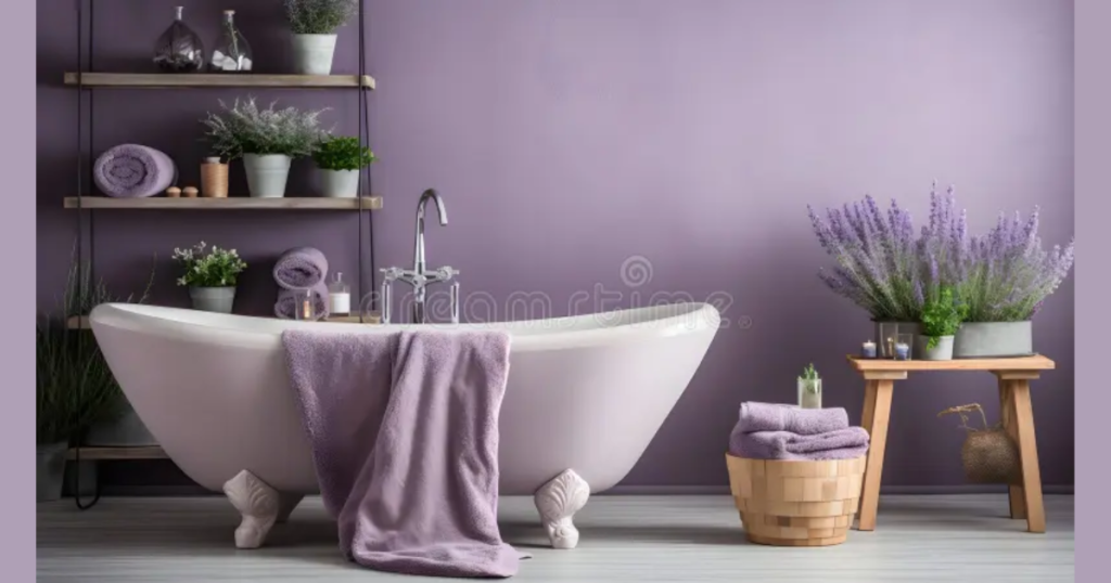
Dusty lavender bathroom paint adds personality subtly.
It feels soft yet different.
This shade works best in powder rooms.
Combine lavender with white tiles.
Keep accessories neutral.
Balance prevents the room from feeling busy.
I suggest testing lavender before full application.
Lighting changes its tone quickly.
Sample patches help avoid mistakes.
12. Light Taupe for Neutral Depth
Light taupe bathroom paint blends gray and beige tones.
It creates depth without heaviness.
This shade suits modern bathrooms.
Taupe pairs well with black fixtures.
It also complements wooden cabinets.
This flexibility makes it practical.
I like taupe in bathrooms with limited light.
It does not feel too dark.
It maintains warmth.
13. Two-Tone Paint Combination for Visual Interest

Two tone bathroom paint ideas add dimension.
Paint the lower half darker and the upper half lighter.
This technique creates structure.
Use white on top and soft gray below.
Add a simple trim line between colors.
Contrast should remain subtle.
Two-tone walls work well in small bathrooms.
They add style without clutter.
This method feels intentional and modern.
Common Bathroom Paint Mistakes to Avoid
Avoid using flat paint in humid areas.
Flat finishes absorb moisture and stain easily.
They require frequent repainting.
Do not ignore ceiling color.
White ceilings keep the bathroom bright.
Dark ceilings shrink visual space.
Avoid skipping primer on darker walls.
Primer ensures smooth color coverage.
It also improves paint durability.
Conclusion
Bathroom paint ideas offer the easiest way to refresh your space.
Color changes mood, brightness, and visual size instantly.
A well-chosen shade transforms the room without renovation.
I always suggest starting with light, balanced tones for safety.
Testing samples saves frustration later.
Choosing the correct finish ensures long-lasting results.
If you read this conclusion first, here is the summary.
Pick moisture-resistant paint, test colors in real lighting, and match fixtures carefully.
Smart planning leads to a successful bathroom makeover.
FAQs
Light colors such as soft white, pale blue, and mint green work best.
They reflect light and create openness.
Avoid very dark tones in tight spaces.
Satin or semi-gloss finishes work best.
They resist moisture and allow easy cleaning.
Matte paint suits only low-humidity powder rooms.
Yes, but use it carefully.
Accent walls work better than full coverage.
Strong lighting balances dark shades.
High-quality paint lasts several years.
Proper ventilation extends durability.
Regular cleaning prevents damage.
Yes, paint color changes how light reflects.
Light shades increase brightness.
Dark shades absorb light.
White ceilings create height and brightness.
They reflect natural and artificial light well.
Most bathrooms benefit from white ceilings.