

The best dining room color scheme ideas combine wall color, furniture tones, lighting, and accents to create a warm, inviting, and visually balanced space. When I choose a dining room color palette, I focus on mood, natural light, and how the space feels during meals and gatherings.
Your dining room is not just a place to eat. It is where family dinners happen, guests sit, and conversations stretch longer than planned. So the right dining room color combination matters more than we think.
In this guide, I am sharing the 10 best dining room color scheme ideas that work in real homes. These are practical, stylish, and easy to apply without hiring a designer.
Why Choosing the Right Dining Room Color Scheme Matters
Choosing the right dining room color scheme sets the mood of your entire home. The colors you select affect how spacious, cozy, modern, or traditional your space feels.
When I redesigned my own dining area, I realized that lighting and wall color changed everything. The same table looked elegant in one color palette and dull in another. That is how powerful color choice can be.
A well-planned dining room color palette also connects your dining space with the kitchen and living room. It creates visual flow and makes your home feel thoughtfully designed.
1. Navy Blue and Crisp White Dining Room Color Scheme
Navy blue and white create a timeless and elegant dining room color combination. This palette works beautifully in both modern and traditional homes.
I recommend painting the main walls navy blue and keeping trim, ceiling, and moldings white. This contrast adds depth without overwhelming the room. Add a walnut or dark wood dining table for warmth.
For accents, choose brass lighting fixtures and white upholstered chairs. This color scheme feels formal yet welcoming, especially for evening dinners.
2. Warm Beige and Soft Brown Dining Room Color Palette
Warm beige and soft brown create a cozy and balanced dining room environment. This combination works well in homes with wooden furniture and neutral décor.
I like using beige for walls because it reflects light softly. Then I add brown through dining chairs, a wooden table, or textured curtains. This layering creates warmth without feeling heavy.
Add cream table linens and warm lighting. This dining room color scheme suits family homes where comfort matters most.
3. Emerald Green and Gold Accent Dining Room Scheme
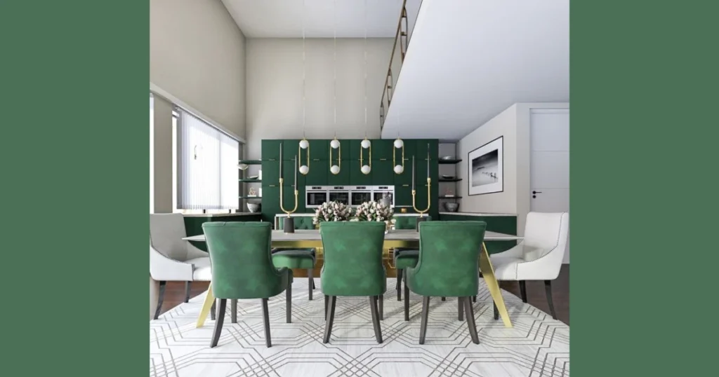
Emerald green and gold create a rich and luxurious dining room color scheme. This combination feels bold but tasteful when balanced correctly.
I usually suggest emerald green on one accent wall rather than all four. Pair it with neutral walls like light cream or soft gray to keep the space grounded.
Gold lighting fixtures, mirror frames, or decorative bowls complete the look. This palette works perfectly in formal dining rooms where you host guests often.
4. Light Gray and White Modern Dining Room Color Idea
Light gray and white create a clean and modern dining room color scheme. This palette feels fresh and works especially well in small dining rooms.
I prefer soft gray walls with white trim and ceiling. This keeps the space bright while adding subtle depth. Add black or chrome lighting for contrast.
This dining room color combination pairs beautifully with glass tables or minimalist furniture. It feels simple but never boring.
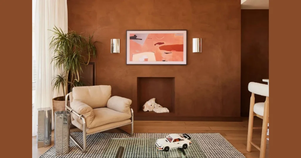
5. Terracotta and Cream Earthy Dining Room Palette
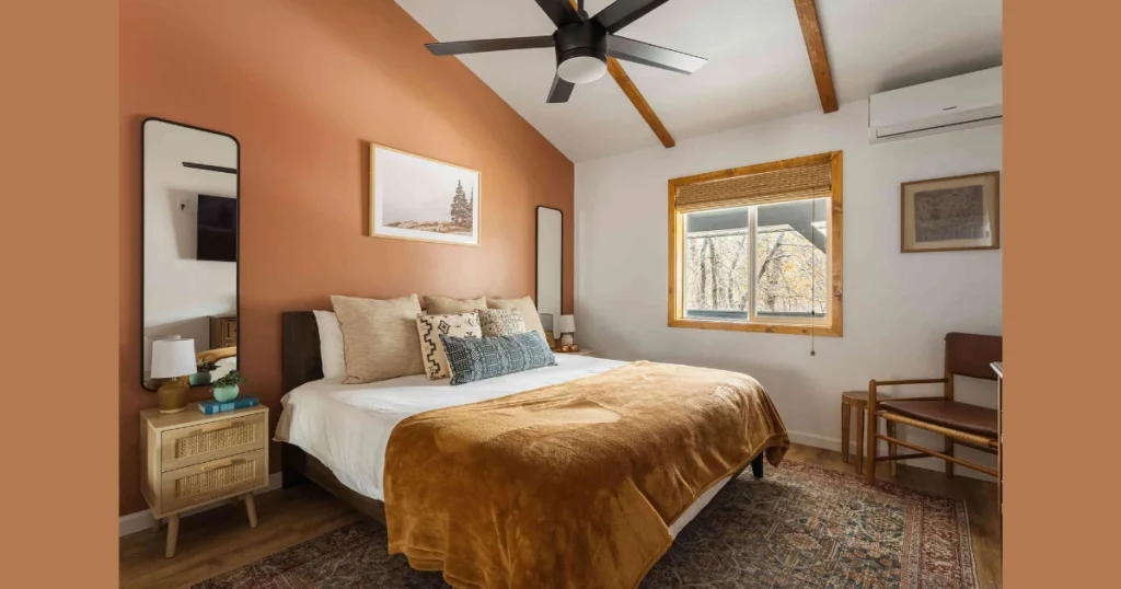
Terracotta and cream create a warm and earthy dining room atmosphere. This scheme adds personality without looking loud.
I often suggest terracotta for an accent wall behind the dining table. Cream walls around it soften the overall look and prevent the room from feeling too dark.
Natural wood furniture, woven rugs, and clay décor pieces enhance this dining room color palette. It feels relaxed and inviting, perfect for long dinners.
6. Charcoal Gray and Blush Pink Dining Room Color Scheme
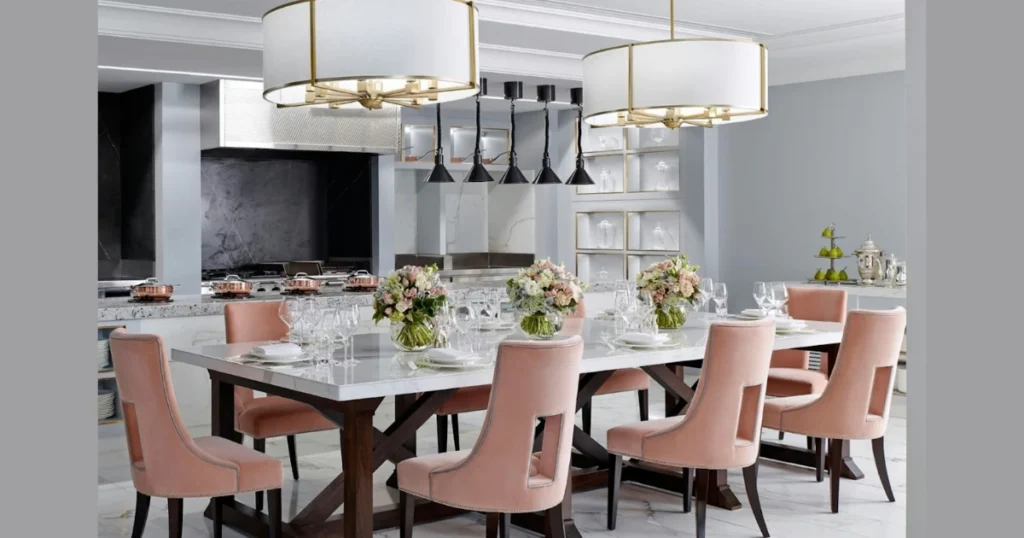
Charcoal gray and blush pink create a balanced dining room color scheme that feels modern yet soft. This combination works well if you want contrast without harshness.
I like using charcoal gray on one main wall and keeping the rest light. Blush pink works beautifully through upholstered chairs, artwork, or curtains. This prevents the space from feeling dark.
Add matte black lighting and a light wood table to balance both tones. This dining room color palette suits contemporary homes and apartments with limited space.
7. Classic Black and White Dining Room Color Combination
Black and white create a bold and timeless dining room color scheme. This palette always looks sharp when applied carefully.
I recommend keeping walls white and introducing black through furniture, frames, or a statement chandelier. Too much black on walls can feel heavy, so balance is important.
A patterned rug in black and white can tie the entire dining area together. This color scheme works perfectly in modern and minimalist interiors.
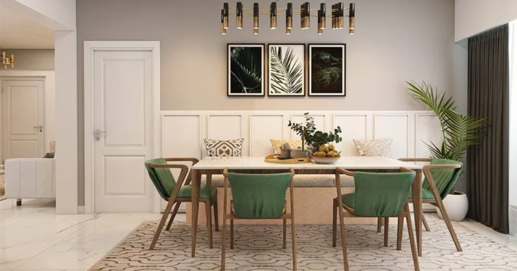
8. Sage Green and Natural Wood Dining Room Color Palette
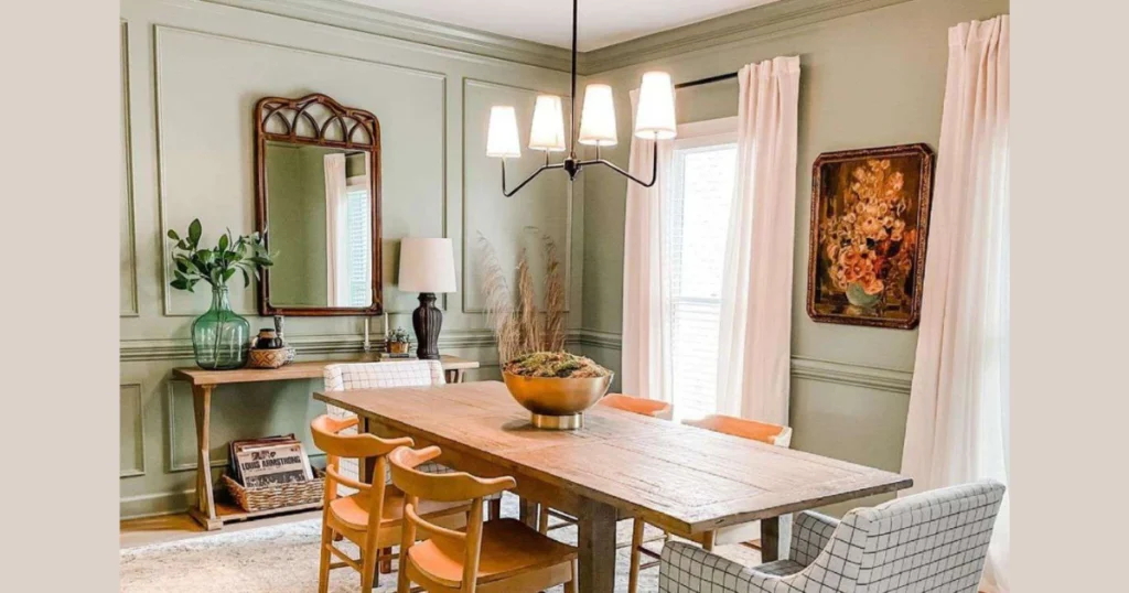
Sage green and natural wood create a calm and refreshing dining room atmosphere. This combination feels light, organic, and welcoming.
I often suggest sage green for all walls in rooms with good natural light. It reflects daylight beautifully and pairs naturally with oak or walnut dining tables.
Add linen curtains and woven textures for depth. This dining room color scheme works especially well in open-plan homes.
9. Deep Burgundy and Soft Cream Dining Room Scheme
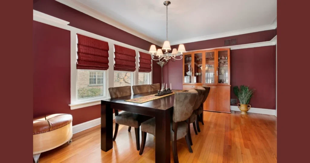
Deep burgundy and soft cream create a dramatic and intimate dining room color scheme. This palette works best in formal dining rooms.
I prefer burgundy as an accent wall behind the dining table. Cream walls around it prevent the room from feeling enclosed.
Add warm lighting and dark wood furniture to complete the look. This combination feels elegant and perfect for evening gatherings.
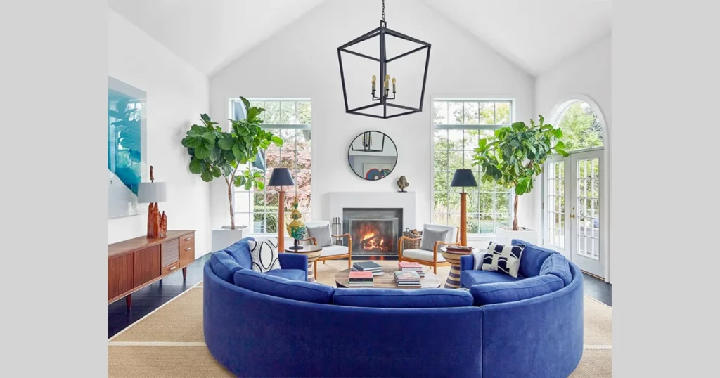
10. Sky Blue and White Bright Dining Room Color Idea
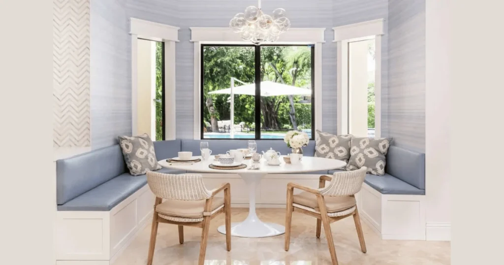
Sky blue and white create a fresh and airy dining room color scheme. This palette works beautifully in small dining rooms.
I recommend sky blue walls paired with white trim and ceiling. This combination reflects light and makes the room feel larger.
Light wood furniture and simple décor complete the look. This dining room color combination feels relaxed and perfect for daytime meals.
Practical Tips to Apply the Best Dining Room Color Scheme Ideas
Applying the right dining room color scheme requires planning lighting, furniture, and décor together. If you only change wall paint and ignore the rest, the room may feel incomplete.
I always test paint samples on the wall before finalizing a shade. Colors look different in morning light and evening light. A small test saves money and regret.
Below are practical tips that help me create a balanced and attractive dining room color palette every time.
1. Use the 60-30-10 Color Rule for Balance
The 60-30-10 rule keeps your dining room color combination visually balanced. This simple formula prevents your space from looking chaotic.
- 60 percent: Main wall color
- 30 percent: Secondary color such as chairs or curtains
- 10 percent: Accent color like décor or lighting
This method works for almost every dining room size. It keeps the design structured and clean.
2. Coordinate Dining Room Colors with Kitchen
Your dining room color scheme should connect with your kitchen for visual flow. If both spaces are visible, mismatched tones can feel awkward.
You do not need identical colors. Just keep the undertone similar. For example, warm beige dining walls pair well with a warm white kitchen.
This small coordination creates harmony without making both rooms look identical.
3. Choose the Right Finish for Dining Room Paint
Paint finish affects the final look as much as the color itself. Many people ignore this detail and later feel dissatisfied.
- Matte finish hides wall flaws
- Eggshell works best for dining rooms
- Satin finish reflects more light
I usually prefer eggshell for dining room walls. It looks smooth and cleans easily.
4. Use Lighting to Enhance Your Color Palette
Lighting changes how your dining room color scheme appears. Warm bulbs enhance warm colors, while cool bulbs sharpen gray and blue tones.
If you choose navy, burgundy, or charcoal, use warm lighting. It softens the intensity and makes the space inviting.
Always test your wall color with the actual chandelier or pendant light installed.
Conclusion
The 10 best dining room color scheme ideas give you ready-to-use combinations that work in real homes. You do not need a designer to create a balanced dining area.
When I choose dining room colors, I focus on lighting, room size, and furniture tone first. This simple approach prevents costly mistakes and gives long-term satisfaction.
If you carefully match wall color, accents, and lighting, your dining room will feel intentional and welcoming. And yes, your guests will notice.
FAQs
The best color depends on lighting and mood preference. Neutral tones like beige, gray, and sage work in most homes.
Light shades such as white, soft gray, and sky blue reflect more light and create spaciousness.
Both rooms should share a similar undertone for harmony. They do not need to be identical.
Dark colors work well in large or well-lit dining rooms. Use them as accent walls in smaller spaces.
Modern trends include sage green, navy blue, warm neutrals, and muted earthy tones.
Stick to three main tones using the 60-30-10 rule for balance.