

Choosing the right dining room paint colors can completely change how the space feels during everyday meals and special gatherings. From my experience, color does more than decorate walls, it influences mood, lighting, and even how welcoming the room feels.
A well-chosen shade can make a dining room feel cozy, elegant, or refreshingly modern without changing any furniture. In this article, I’ll share practical dining room paint colors ideas that I’ve seen work beautifully in real homes.
Each option focuses on balance, warmth, and long-term appeal, helping you create a dining space that feels intentional and inviting.
1. Warm Neutral Beige
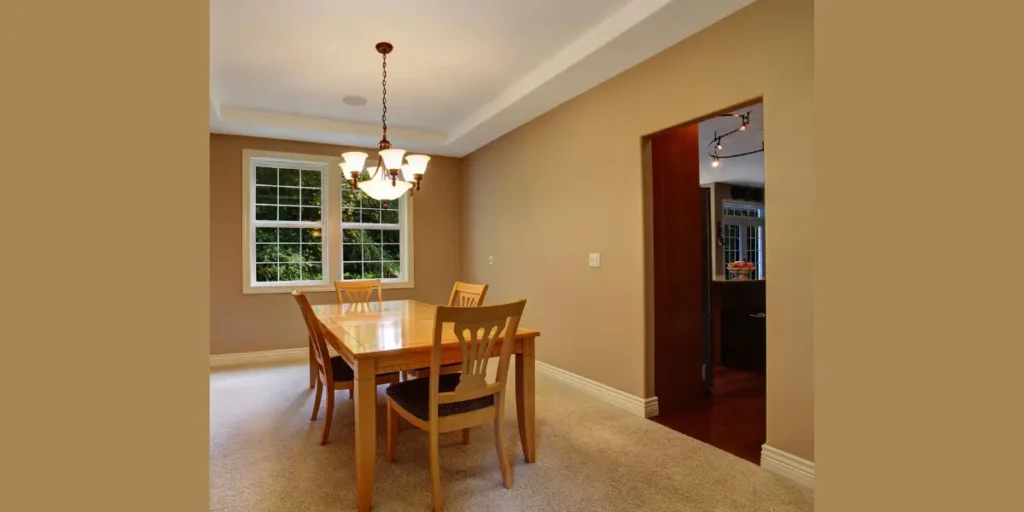
I often recommend warm neutral beige when someone wants a dining room that feels instantly welcoming. This color creates a soft backdrop that doesn’t overpower the space and works well in both bright and low-light rooms. It’s especially effective if the dining room connects to other areas of the home.
Beige allows furniture, lighting, and artwork to stand out naturally. I like pairing it with wooden tables or upholstered chairs because it enhances warmth without looking dated. The tone feels familiar yet refined.
What makes beige reliable is its longevity. Even as décor trends change, a warm beige dining room continues to feel comfortable, balanced, and easy to update over time.
2. Soft Greige (Grey with Beige Undertones)
Soft greige is one of my go-to choices for modern dining rooms. It offers the sophistication of grey while retaining the warmth of beige, which prevents the space from feeling cold. This balance makes it incredibly versatile.
I’ve found greige works beautifully with both metal and wood finishes. It adapts well to changing light throughout the day, which is important in dining spaces used at different times.
Greige creates a polished yet relaxed atmosphere. It’s ideal if you want a dining room that feels contemporary but still comfortable enough for everyday family meals.
3. Muted Sage Green
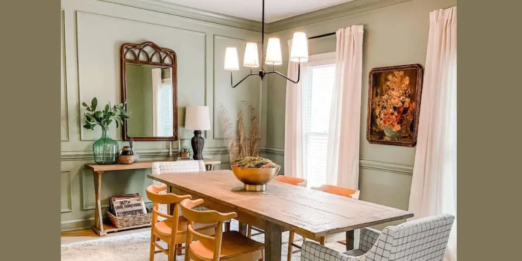
When clients want a calming dining environment, I often suggest muted sage green. This color brings a subtle connection to nature without feeling too bold or trendy. It creates a relaxed atmosphere that encourages longer meals.
Sage green pairs exceptionally well with natural materials like wood, linen, and stone. I like using it in dining rooms that receive good natural light because it shifts beautifully throughout the day.
This color feels fresh yet timeless. It adds character without overwhelming the space, making the dining room feel grounded, peaceful, and thoughtfully designed.
4. Classic Navy Blue
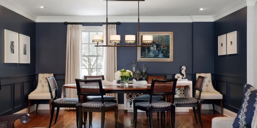
Navy blue is my choice when a dining room needs drama and depth. It creates a strong visual impact and instantly elevates the space, especially in formal or semi-formal dining rooms.
I balance navy walls with warm lighting and lighter furniture to keep the room from feeling heavy. Gold or brass accents work particularly well with this color.
Navy blue feels intentional and elegant. When used correctly, it turns the dining room into a statement space that still feels inviting rather than intimidating.
5. Soft Warm Grey
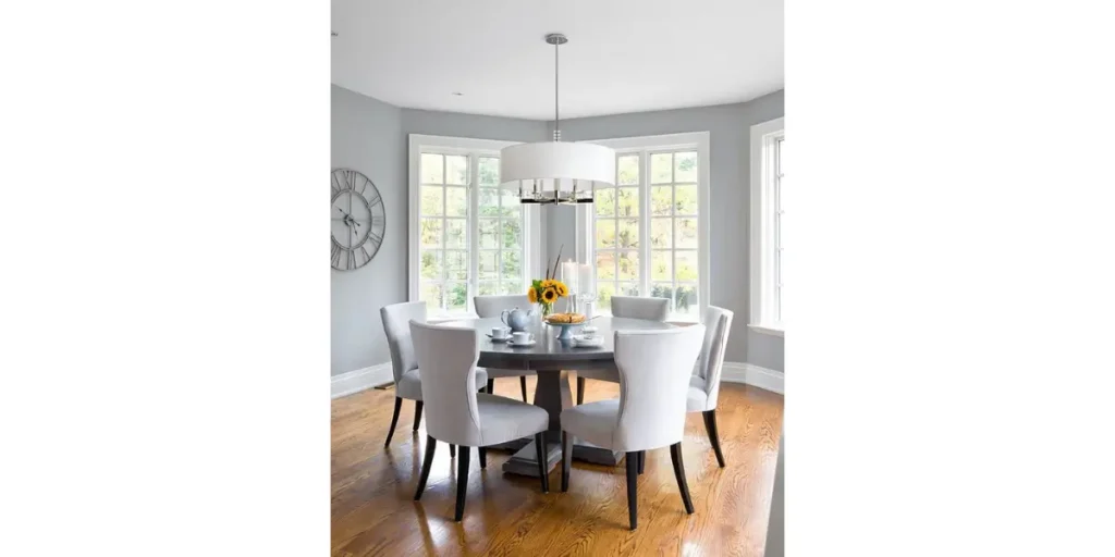
Soft warm grey offers a clean, modern look without the harshness of cooler greys. I use this color when a dining room needs refinement but still has to feel comfortable.
This shade works well with both minimalist and classic interiors. I often pair it with textured fabrics or warm wood tones to add depth and prevent flatness.
Warm grey provides flexibility. It adapts easily to changing décor and lighting, making it a smart choice for homeowners who want a neutral but stylish dining room.
6. Earthy Terracotta
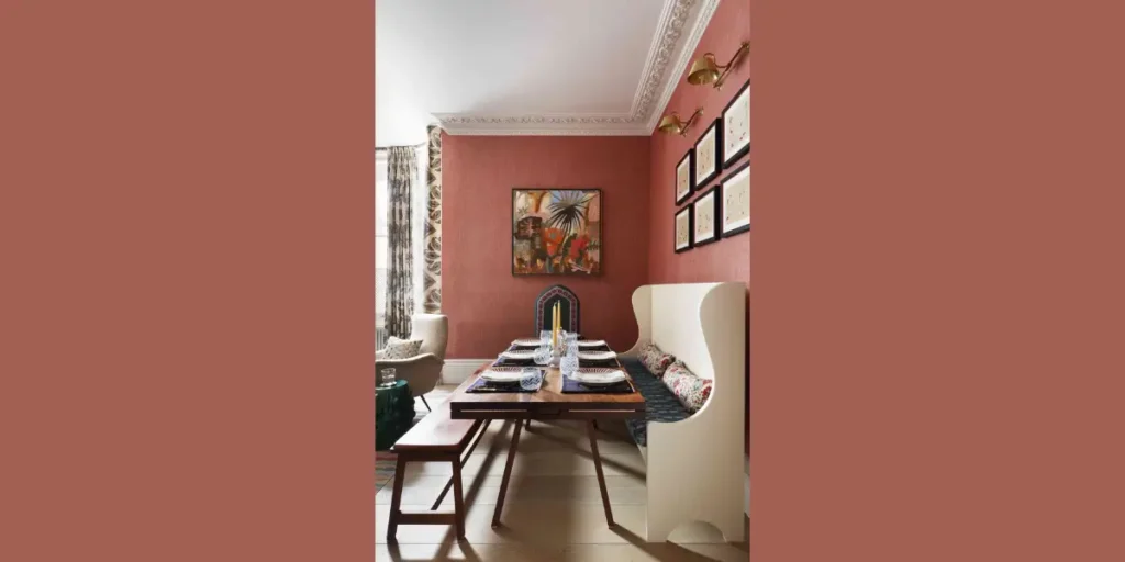
Terracotta is a powerful choice for dining rooms that need warmth and personality. I recommend this color when the goal is to create a cozy, grounded atmosphere.
Its earthy tone pairs beautifully with wood furniture and natural textures. I usually balance terracotta walls with neutral accents to keep the space from feeling overwhelming.
Terracotta brings energy without being loud. It makes the dining room feel intimate and expressive, encouraging connection and comfort during meals.
7. Creamy Off-White
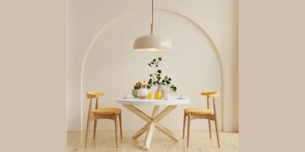
Creamy off-white is ideal when a dining room needs brightness without feeling stark. I prefer it over pure white because it adds softness and warmth to the space.
This color reflects light well, making smaller dining rooms feel more open. It also allows statement furniture or lighting to take center stage.
Off-white is timeless and flexible. It creates a clean foundation that supports almost any design style while keeping the dining room feeling light and welcoming.
8. Charcoal Grey Accent Wall
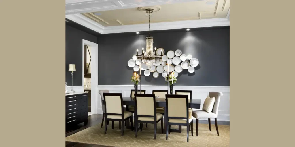
I often use charcoal grey as an accent wall when a dining room needs depth without committing to a fully dark space. It creates a focal point and adds sophistication.
I usually pair this accent with lighter surrounding walls to maintain balance. Proper lighting is essential to keep the space from feeling closed in.
Charcoal adds contrast and drama. Used strategically, it gives the dining room a modern, upscale feel without overwhelming the overall design.
9. Dusty Blue
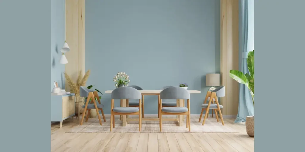
Dusty blue is a subtle color that brings calm and elegance to a dining room. I recommend it for spaces that need color without strong contrast.
This shade works well in both casual and refined settings. I often pair it with neutral chairs and natural textures to maintain balance.
Dusty blue feels relaxed and thoughtful. It softens the dining space and creates an atmosphere that feels composed, comfortable, and visually pleasing.
10. Warm Taupe
Warm taupe is a rich neutral that adds depth while remaining understated. I like using it when a dining room needs warmth but still wants a refined appearance.
Taupe pairs beautifully with wood furniture and layered textures. It adapts well to different lighting conditions, which makes it reliable.
This color feels elegant without being formal. It supports a dining room that’s both inviting and polished, suitable for daily use and special occasions alike.
How to Choose a Dining Room Paint Color That Enhances Appetite and Mood
When I select dining room paint colors, I always consider how color affects mood and appetite. Warm and earthy tones tend to create a welcoming atmosphere that encourages people to relax and enjoy their meals. Cool tones can work too, but they need the right lighting balance to avoid feeling cold.
Lighting plays a huge role in how paint colors appear. I always test colors at different times of day to see how natural and artificial light change their tone. This prevents unexpected results after painting.
I also think about how often the dining room is used. A color that feels calming yet visually engaging usually works best for spaces used daily as well as for entertaining.
FAQs
From my experience, warm neutrals and muted colors work best for everyday dining rooms. They create a comfortable atmosphere without feeling overpowering and adapt well to changing décor and lighting.
Both can work depending on the room. I recommend lighter colors for smaller or low-light dining rooms, while darker shades look great in larger spaces with good lighting and proper contrast.
Yes, I often suggest using bold colors as accent walls rather than painting the entire room. This adds character and depth while keeping the space balanced and visually comfortable.
I always advise painting large sample areas on different walls and observing them over a few days. This helps you see how the color reacts to light and ensures it feels right in the space.
Related Post
- Top 14 Smart Dining Room Remodel Ideas
- Top 12 Dining Room Table and Chair Ideas
- Top 11 Dining Room Remodel Ideas
- Top 12 Best Dining Room Lamps Ideas
- 10 Best Dining Room Rug Ideas
- Top 15 Dining Room Wallpaper Ideas
Conclusion
Choosing the right dining room paint color is one of the most impactful design decisions you can make. From my experience, the best colors do more than look good, they shape the mood, influence comfort, and support how the space is used every day.
When you consider lighting, furniture, and lifestyle before selecting a shade, the dining room feels balanced and intentional.
Whether you prefer warm neutrals or deeper tones, thoughtful color choices create a welcoming environment that encourages connection and enjoyment. A well-painted dining room doesn’t just enhance the walls; it elevates the entire dining experience.