
Bathroom color options help you create a space that feels clean, relaxing, and visually appealing without a major renovation. The right color choice can make a small bathroom look bigger, a dark bathroom brighter, and an outdated bathroom modern. I always notice that changing color alone often gives the biggest improvement with the least effort.
How Choosing the Right Bathroom Color Changes the Entire Look
The right bathroom color improves both mood and visual comfort because bathrooms are used daily for routines and relaxation. Soft tones create calm energy, while bold colors add personality depending on your style preference.
Lighting also affects how bathroom colors appear because natural and artificial light change shade perception. Testing paint samples before final selection always prevents disappointment later.
1. White Bathroom Color for a Clean and Spacious Look
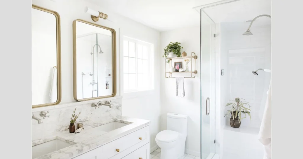
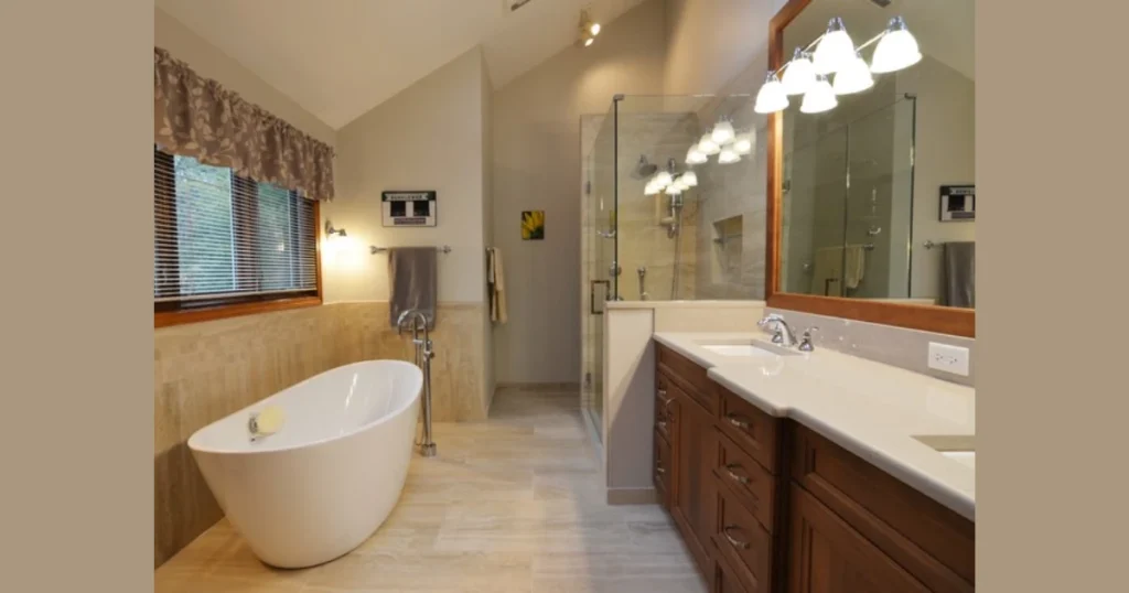
White bathroom color works best because it creates a bright and open feeling even in small spaces. I personally recommend white for compact bathrooms because it reflects light and makes the room appear larger.
White also pairs easily with any material, like wood, marble, or metal fixtures, which makes decorating simple later. Many homeowners prefer white because it never feels outdated.
Adding texture through tiles, cabinets, or accessories prevents white bathrooms from looking plain. Mixing warm white and cool white tones also creates depth without overwhelming the space.
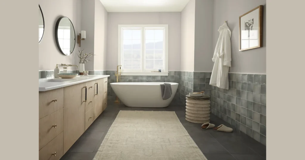
2. Soft Gray Bathroom Color for a Modern Feel
Soft gray bathroom color creates a balanced and contemporary atmosphere without feeling too dark. Gray works well because it sits between warm and cool tones, making it versatile.
I often suggest light gray for walls with white fixtures because the contrast looks clean and professional. Gray also hides minor stains better than pure white, which is practical.
Combining gray with metallic accents like chrome or brushed nickel enhances the modern appearance. Warmer gray shades can also add comfort to the space.
3. Blue Bathroom Color for a Calm and Relaxing Space
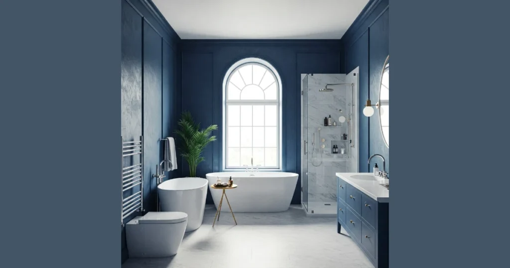
Blue bathroom color feels naturally calming because the color connects with water and sky. Light blue shades often create a spa-like atmosphere that many people enjoy.
I find navy blue works well for cabinets or accent walls because it adds depth without overwhelming the room. Pairing blue with white tiles creates a classic combination.
Using different blue tones together adds visual interest while maintaining harmony. Soft lighting also enhances blue shades beautifully in bathrooms.
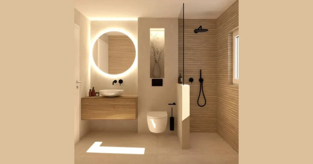
4. Beige and Neutral Bathroom Color for Warm Comfort
Beige bathroom color creates warmth because neutral tones feel inviting and comfortable. Many people prefer beige because it avoids the cold feeling that some grays create.
I recommend beige for bathrooms with limited natural light because warmer tones prevent the space from looking dull. Beige also blends well with wood finishes and natural stone.
Layering different neutral shades adds richness without making the room busy. Textured tiles or wooden accents further enhance the cozy effect.
5. Green Bathroom Color for a Fresh Natural Look
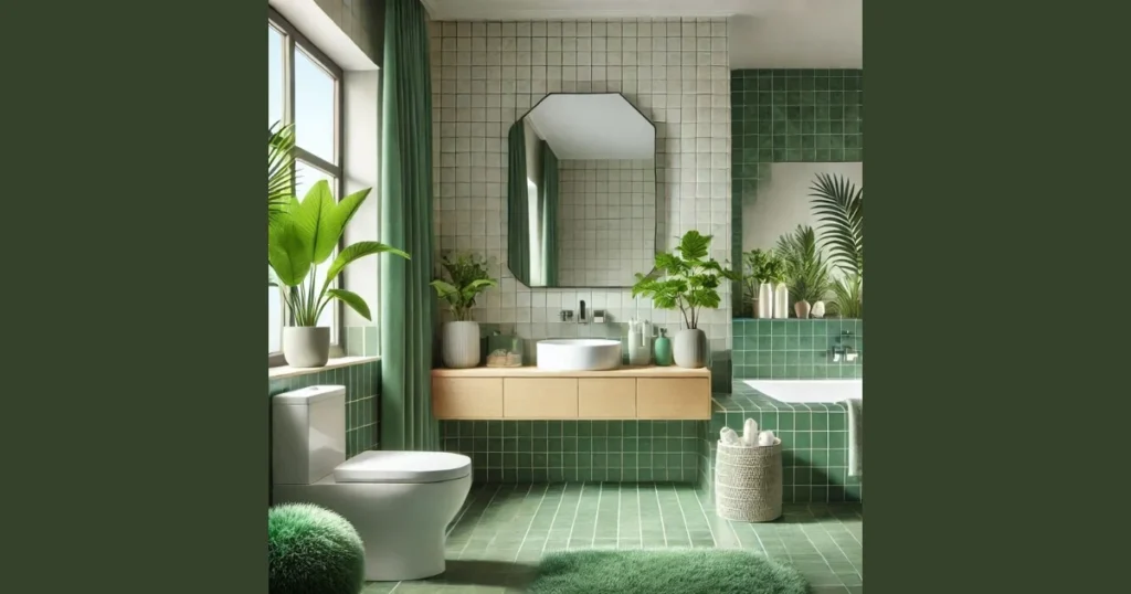
The green bathroom color feels refreshing because it connects with nature and relaxation. Soft sage or mint green tones often create a peaceful environment.
I personally like pairing green walls with white or light wood cabinets because the combination looks balanced. Plants also complement green bathrooms naturally.
Darker greens like forest green add drama when used carefully on cabinets or accent areas. Choosing the right shade based on lighting ensures the color looks pleasant.
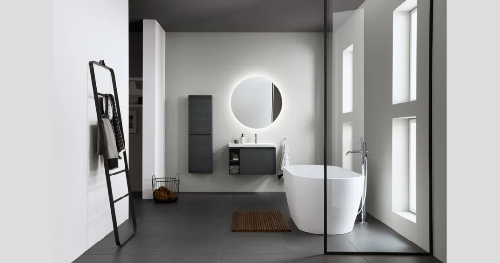
6. Black Bathroom Color for Bold and Elegant Style
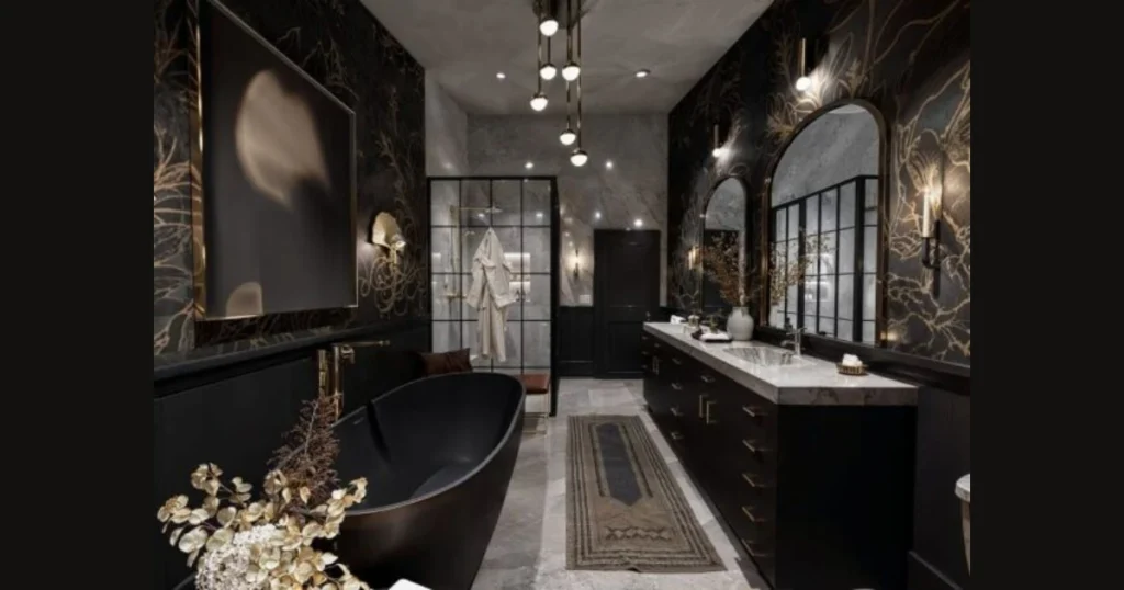
Black bathroom color creates a dramatic and sophisticated atmosphere because dark tones add depth and contrast instantly. I usually recommend black for accent walls or cabinets rather than full walls because balance keeps the space comfortable.
Black pairs beautifully with white sinks, gold fixtures, or marble surfaces, which creates a high contrast appearance. Many modern bathrooms use black to add a luxury feel without a complex design.
Proper lighting is important because dark colors absorb light and can make small bathrooms feel smaller. Using mirrors and bright lights helps maintain visual balance.
7. Pastel Bathroom Color for Soft and Airy Feeling
Pastel bathroom color creates a gentle and soothing environment because light tones feel calm and welcoming. Shades like blush pink, powder blue, or lavender often work well in smaller spaces.
I personally like pastel colors for guest bathrooms because they feel pleasant without being overwhelming. Soft tones also reflect light better than darker shades.
Combining pastel walls with white fixtures keeps the design fresh and clean. Minimal decor works best with pastel colors to maintain simplicity.
8. Earth Tone Bathroom Color for Natural Warmth
Earth tone bathroom color brings a grounded and relaxing atmosphere because colors like terracotta, sand, and clay feel connected to nature. These shades often create warmth without being too dark.
I recommend earth tones for bathrooms with wooden cabinets or stone elements because the combination feels harmonious. Natural textures enhance the overall appearance.
Using lighter earth shades on walls and deeper tones on accents creates balance. Warm lighting also improves the cozy effect.
9. Two Tone Bathroom Color for Visual Contrast
Two-tone bathroom color creates visual interest because combining two shades prevents the space from looking flat. Many homeowners use light colors on top walls and darker shades below.
I find this approach helpful for adding personality without overwhelming the bathroom. Vertical or horizontal separation lines also change how spacious the room feels.
Choosing colors from the same family ensures harmony while still providing contrast. Neutral combinations like gray and white work well for most bathrooms.
10. Navy Bathroom Color for Rich and Stylish Look
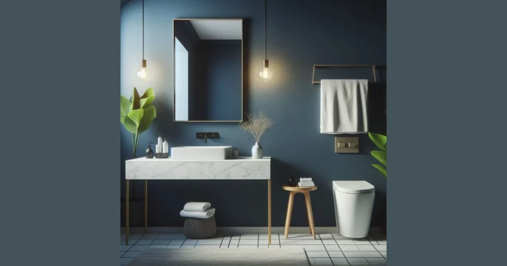
Navy bathroom color adds richness because deep blue tones create depth while still feeling calm. Navy works especially well for vanity cabinets or accent walls.
I often suggest navy with brass or gold fixtures because the combination looks refined and balanced. White countertops also enhance the contrast.
Proper lighting is necessary because deep shades can appear darker in low-light bathrooms. Layered lighting improves visibility and appearance.
Important Factors Before Painting
- Consider bathroom size and lighting conditions
- Match the color with tiles and fixtures
- Test paint samples on walls before the final choice
- Use moisture-resistant paint for durability
- Choose finishes that are easy to clean
Bathroom Paint Finish Guide Table
| Finish Type | Best Use | Benefit |
|---|---|---|
| Matte | Low traffic bathrooms | Soft appearance |
| Eggshell | Most bathrooms | Easy cleaning |
| Satin | High moisture areas | Durable |
| Semi Gloss | Trim and cabinets | Water resistant |
Conclusion
Bathroom color choices influence both mood and visual comfort because color sets the entire atmosphere of the space. Even simple color changes can make bathrooms feel brighter, larger, and more inviting without an expensive renovation.
The most important takeaway is to select colors based on lighting, size, and personal comfort because practical decisions always produce better long-term satisfaction. When color, lighting, and materials work together, the bathroom naturally feels more enjoyable to use.
FAQs
Light colors like white, soft gray, or pastel shades usually make small bathrooms appear larger.
Yes, dark colors work well when balanced with proper lighting and lighter fixtures.
Two to three coordinated colors usually create the best balance without clutter.
Satin or semi-gloss finishes resist moisture and clean easily.
Yes, bold colors work well for accent walls, cabinets, or decorative areas.
Consider lighting, space size, fixtures, and personal preference before selecting paint.
Yes, neutral tones remain timeless and flexible for future decor changes.